How to Animate a Control Chart
Recently, I wrote a post about creating control charts in R, and now I want to experiment with animating one of those charts.
Lets start with the tidyverse, gganimate, and ggQC.
library(tidyverse)
library(gganimate)
library(ggQC)
Now, lets rebuild the last control chart from my previous post.
# Generate sample data
set.seed(20190117)
example_df <- data_frame(values = rnorm(n=30*5, mean = 25, sd = .005),
                         subgroup = rep(1:30, 5),
                         n = rep(1:5, each = 30)) %>%
  add_row(values = rnorm(n=2*5, mean = 25 + .006, sd = .005),
          subgroup = rep(31:32, 5),
          n = rep(1:5, each = 2))

violations <- example_df %>%
  QC_Violations(value = "values", grouping = "subgroup", method = "xBar.rBar") %>%
  filter(Violation == TRUE) %>%
  select(data, Index) %>%
  unique()

ggQC_example <- example_df %>%
  ggplot(aes(x = subgroup, y = values)) +
  stat_summary(fun.y = mean, geom = "line", aes(group = 1)) +
  stat_summary(fun.y = mean, geom = "point", aes(group = 1)) +
  stat_QC(method = "xBar.rBar", auto.label = TRUE, label.digits = 4) +
  scale_x_continuous(expand =  expand_scale(mult = c(.05, .15))) + # Pad the x-axis for the labels
  ylab("x-bar") +
  theme_bw() +
  geom_point(data = violations, aes(x = Index, y = data), color = "red", group = 1)
ggQC_example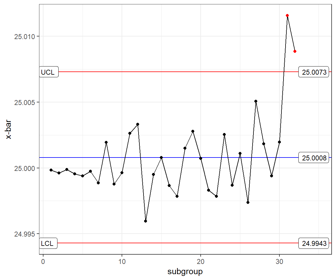
You can see that I added some grouping variables to try to control the annimation, but I couldn’t get it to look right. Take a look:
ggQC_example +
  transition_reveal(subgroup)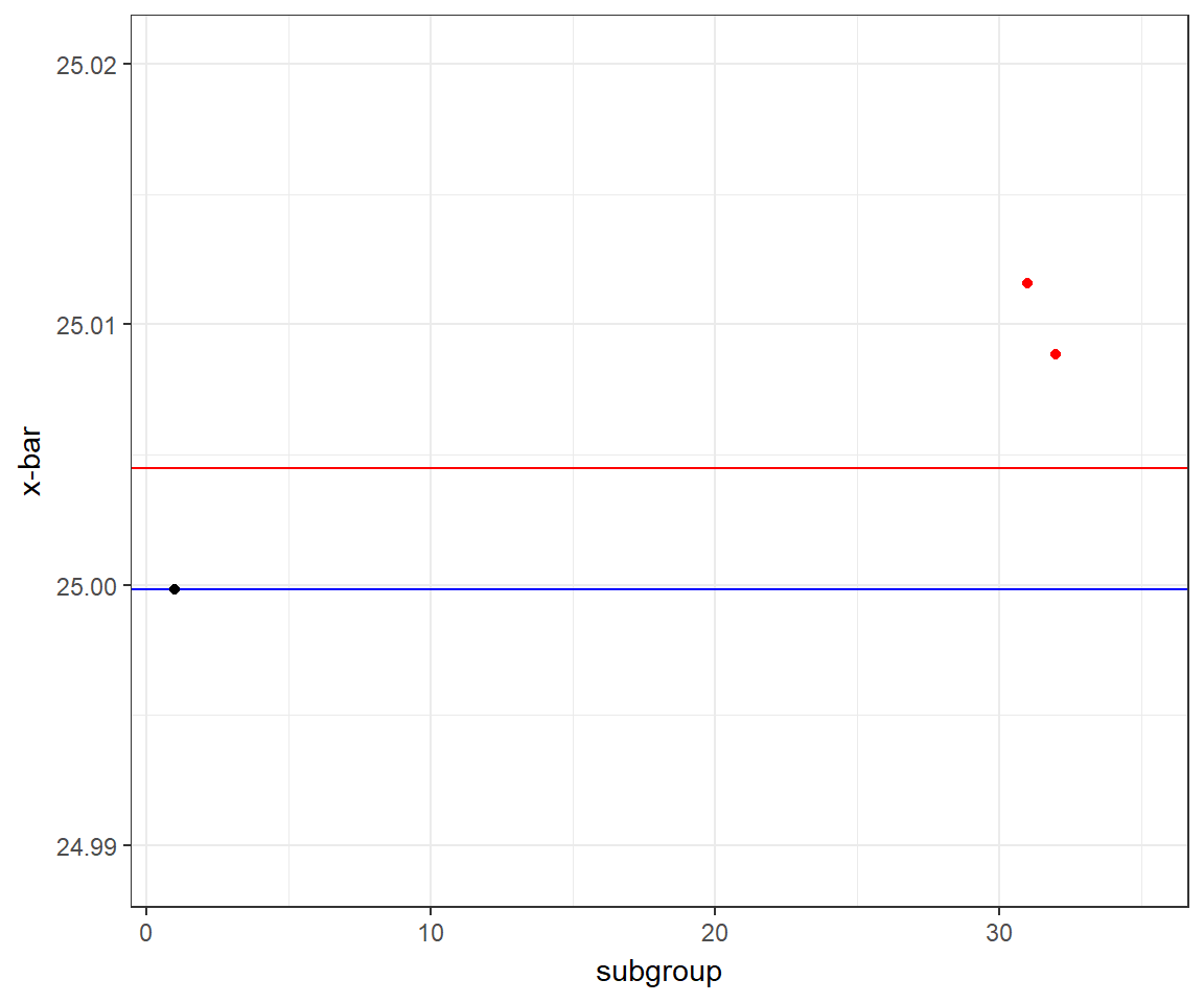
Ok, setting the red points asside, the graph seems to recalculate the control limits for each frame. Let’s try making the same plot from a tidy dataset, and see if that annimates a little more nicely.
UCL <- xBar_rBar_UCL(data = example_df, value = "values", grouping = "subgroup")
LCL <- xBar_rBar_LCL(data = example_df, value = "values", grouping = "subgroup")

take_two_df <- example_df %>%
  group_by(subgroup) %>%
  summarise(point = mean(values)) %>% # caluculate the x-bar points
  left_join(violations, by = c("subgroup" = "Index"), suffix = c("normal", "violation")) %>% # add the information about which points are out-of-control
  mutate(control = case_when( # supply missing information from the join
    is.na(data) ~ "out",
    TRUE ~ "in"
  ))

take_two <- take_two_df %>%
  ggplot(aes(x = subgroup, y = point)) +
  geom_line() +
  geom_point(aes(group = subgroup, color = control)) + # adding the group aes keeps the points from dissapearing
  geom_hline(yintercept = c(LCL, UCL), color = "red") + # usin geom_hline keeps the line from annimating
  geom_hline(yintercept = (UCL + LCL) / 2, alpha  = .5) +
  xlab("x-bar") +
  ylab("subgroup") +
  scale_color_manual(values = c("red", "black")) + # manually color the in-control vs out-of-control points
  ggtitle("Annimated Control Chart") +
  theme_bw() +
  theme(legend.position = "none") + # the legend is self-explanatory
  transition_reveal(subgroup) # specify the annimation

animate(take_two, end_pause = 10) # using the animate() function allows me to set the end_pause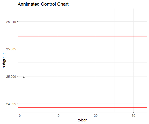
Sure enough, that worked much more nicely. The lesson learned is that items that are calculated at the time of plotting act differently from those that are simply data being thrown on a graph. I couldn’t figure out how to get stat_QC (which is calculated at run-time when plotting) to remain static, so I had to create a tidy dataset with all the information that I needed.
Regardless, ggannimate makes annimations way easier than trying to creating all of those individual plots on their own and then combining them into a .gif. It would only be 32 plots if I wanted it to jump from point-to-point, but notice that the lines also get drawn rather than jumping.