Evenly Spaced Month Charts
I recently noticed that ggplot2 spaces date axes literally even when grouped by month. I’ve been using ggplot2 extensively for years and I don’t remember noticing before, so this is not really a big deal, but now that I know it bugs me a lot. Take a look below.
As always, let’s load the tidyverse.
library(tidyverse)Next, we need some example data. Nothing fancy, just something to plot as an example.
month_data <- tibble(dates = seq(ymd("2023-11-01"), ymd("2024-04-30"), by = "day"),
                     data = sample(1:1e3, 182)) |>
  mutate(month = floor_date(dates, "month")) |>
  group_by(month) |>
  summarise(monthly_mean = mean(data))

month_data
## # A tibble: 6 × 2
## month monthly_mean
## <date> <dbl>
## 1 2023-11-01 572.
## 2 2023-12-01 601.
## 3 2024-01-01 471.
## 4 2024-02-01 562.
## 5 2024-03-01 487.
## 6 2024-04-01 438.Now let me show you how the distance between the months is not equal.
month_data |>
  ggplot(aes(x = month, y = monthly_mean)) +
  geom_col(width = 29) +
  ggtitle("The Months Are Not Spaced Evenly!") +
  # add the year to the first month plotted in each year
  scale_x_date(labels = scales::label_date_short())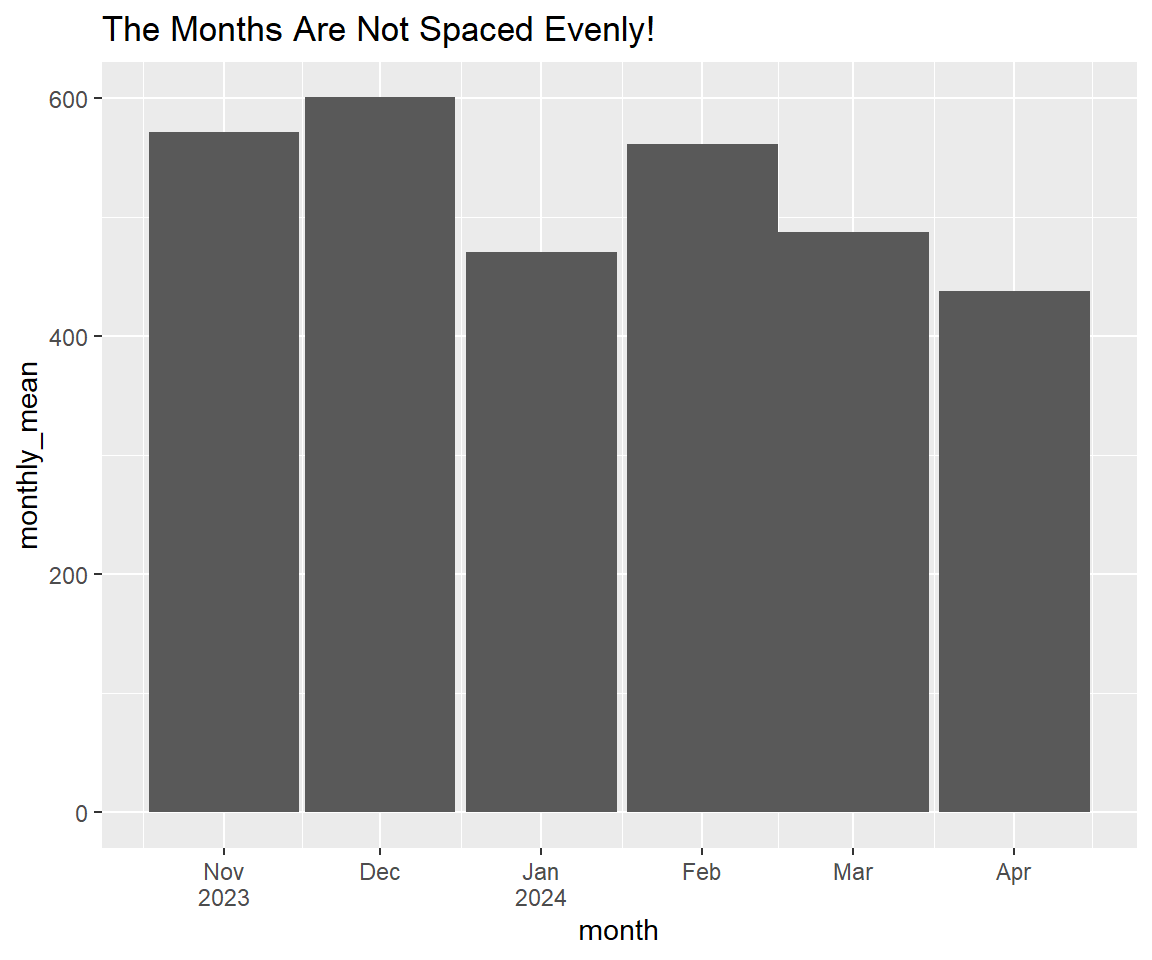
How frustrating! The fix is not that hard, though. We are going to change the date axis to factors with a neat little trick. We’re going to hack the label_date_short() function to change the dates to text and then change the dates to factors. Here we go.
# get the label_date_short() function
prettify_dates <- scales::label_date_short()

# we use the new function we made and make the dates factors so that they sort
# correctly.
new_month_data <- month_data |>
  mutate(pretty_month = prettify_dates(month),
         pretty_month = as_factor(pretty_month))

new_month_data
## # A tibble: 6 × 3
## month monthly_mean pretty_month
## <date> <dbl> <fct>
## 1 2023-11-01 572. "Nov\n2023"
## 2 2023-12-01 601. "Dec"
## 3 2024-01-01 471. "Jan\n2024"
## 4 2024-02-01 562. "Feb"
## 5 2024-03-01 487. "Mar"
## 6 2024-04-01 438. "Apr"Now all we have to do is drop the date scale and let geom_col() chose its own width.
new_month_data |>
  ggplot(aes(x = pretty_month, y = monthly_mean)) +
  geom_col() +
  ggtitle("The Spacing Is Even Now!")