Individuals Control Charts
This post is a follow-up two my two recent posts on generating control charts in R, and animating them. One thing that I’ve been wondering about is how to calculate a range chart without using a package like ggQC or qcc. I knew that I could do it using a loop, but I was looking for a dplyr method when I stumbled on the dplyr::lag() function in this article on stackoverflow. It should work like a charm!
First, let’s load the tidyverse and generate some sample data.
library(tidyverse)set.seed(1558635665)
control_chart_tibble <- tibble(x = rnorm(n = 30, mean = 25, sd = .005))
control_chart_tibble## # A tibble: 30 x 1
## x
## <dbl>
## 1 25.0
## 2 25.0
## 3 25.0
## 4 25.0
## 5 25.0
## 6 25.0
## 7 25.0
## 8 25.0
## 9 25.0
## 10 25.0
## # ... with 20 more rowsNow we can use the lag() function to calculate the range between each row.
control_chart_tibble <- control_chart_tibble %>%
  mutate(mr = abs(x - lag(x, 1)))
control_chart_tibble
## # A tibble: 30 x 2
## x mr
## <dbl> <dbl>
## 1 25.0 NA
## 2 25.0 0.0118
## 3 25.0 0.00396
## 4 25.0 0.000981
## 5 25.0 0.00289
## 6 25.0 0.00344
## 7 25.0 0.00420
## 8 25.0 0.00482
## 9 25.0 0.00306
## 10 25.0 0.000677
## # ... with 20 more rowsThe first row under the r column is NA because the first range is between the first and second rows and it gets stored in the second row.
Now the only thing left to do is calculate the control limits for the individuals and range charts.
To estimate the variance we’ll use the average of the r column (i.e. r-bar) and use the d2 constant as if we had two data-points for each observation. This will be more accurate than simply calculating the standard deviation using R’s built-in sd() function. Keep in mind when you do this that individuals charts like these won’t work very well if your data deviates even a little bit from a normal distribution. x-bar charts where you take the average of n data-points are less sensitive to the assumption of normality because of the central limit theorem.
Ok, enough boring stuff. Let’s do the math!
control_chart_tibble <- control_chart_tibble %>%
  mutate(x_cl = mean(x), # x-bar centerline
         mr_cl  = mean(mr, na.rm = TRUE), # moving range centerline
         x_ucl  = x_cl + 3 * mr_cl/1.1284, # x-bar UCL = x-bar + 3 * r-bar / d2
         x_lcl  = x_cl - 3 * mr_cl/1.1284, # x-bar LCL = x-bar - 3 * r-bar / d2
         mr_ucl = 3.2665 * mr_cl, # moving range UCL = D2 * r-bar
         mr_lcl = 0, # moving range LCL = 0
         n      = row_number()) %>%
  gather(key = "type", value = "value", -n) %>%
  mutate(chart = case_when( # Add a column to facet by
    str_detect(type, "x") ~ "Individuals",
    str_detect(type, "mr") ~ "Moving Range"))

control_chart_tibble %>%
  ggplot(aes(y = value, x = n, group = type)) +
  # the "group" aes allows us to display different data without differentiating it on the chart
  geom_line() +
  facet_grid(chart~., scales = "free") +
  ggtitle("Example X-Moving Range Chart") +
  theme_bw() +
  theme(axis.title.x = element_blank(), axis.title.y = element_blank())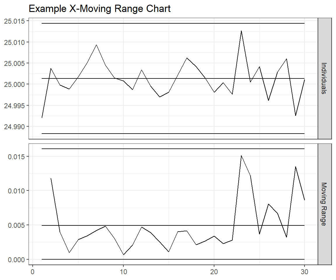
That’s a wrap! Let me know what you think in the comments.